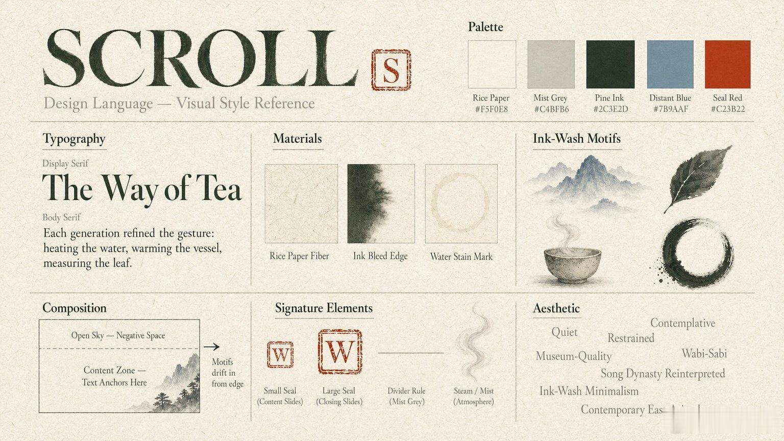
今天试 Manus 的时候 get 到一个提示词小技巧:画图别用提示词去控制风格,直接丢参考图更管用。参考图里把颜色、字体示范、宣纸纤维、墨迹边缘、水痕、远山、印章还有留白规则都带上了。
这么做出图稳定多了,内容提示词也能写得很简单。
图1:参考图
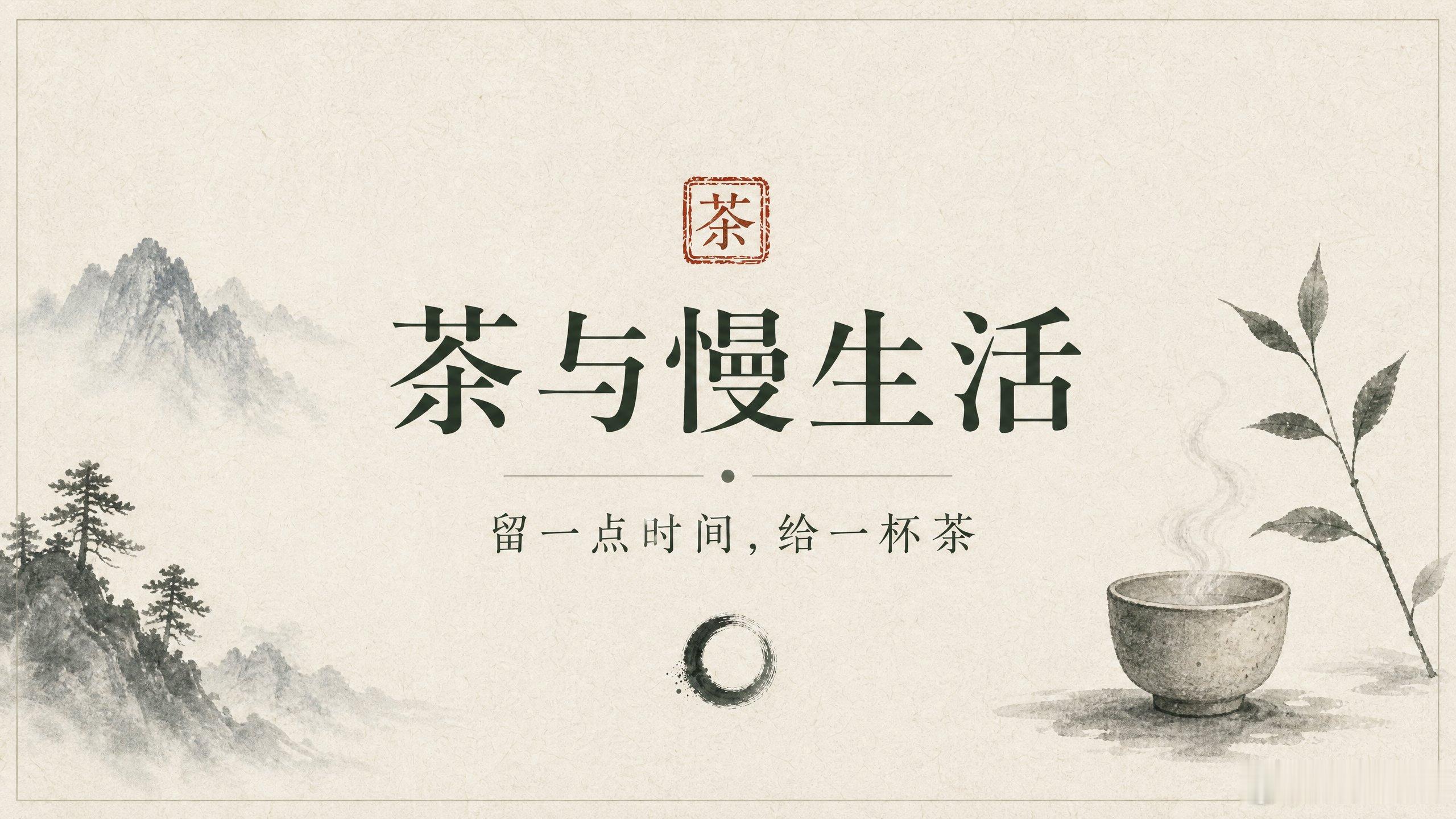
图2 的 content_prompt:> 标题“茶与慢生活”,副标题“留一点时间,给一杯茶”。设计要按参考图的风格来:安静、内敛、侘寂,水墨极简加水墨留白,背景用宣纸纹理。文字居中、清楚。
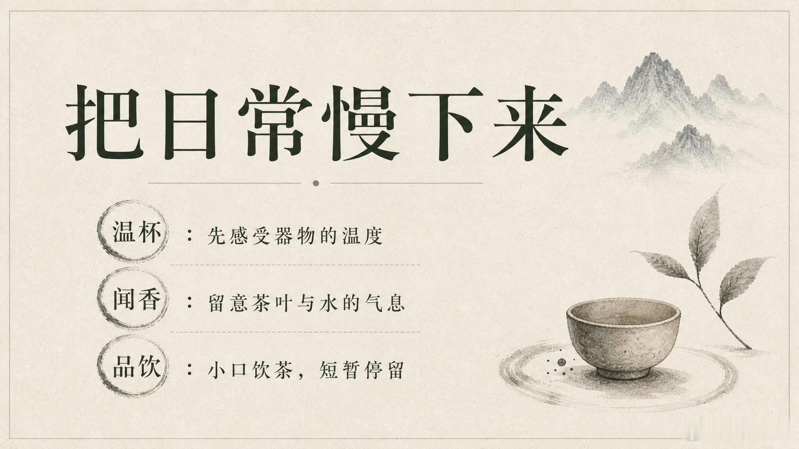
图3 的 content_prompt:> 标题“把日常慢下来”。内容:“温杯:先感受器物的温度”“闻香:留意茶叶与水的气息”“品饮:小口饮茶,短暂停留”。设计要跟着第一页和参考图的风格:安静、内敛、水墨极简,在留白区域用少量水墨元素点缀(比如远山、茶具水痕之类),背景是宣纸纹理。文字排版要有层次感,也要留白。
--- 图2 完整提示词 ---
Create a professional presentation slide with the following content:
标题“茶与慢生活”,副标题“留一点时间,给一杯茶”。设计要按参考图的风格来:安静、内敛、侘寂,水墨极简加水墨留白,背景用宣纸纹理。文字居中、清楚。
Hierarchy & Layout Guidance:- Lead with the most important narrative element (headline / metric) and follow with supporting copy in clear sections- Any charts should reflect real data provided in the content prompt and stay faithful to the described sources- Arrange imagery and copy so the viewer can scan left-to-right or top-to-bottom; avoid vertical stacking of charts/images
Visual Direction:- Professional and clean- Follow the style of the previous slide image (if provided) for visual continuity
Requirements:- Professional presentation layout with clear visual hierarchy- Text must be clearly readable with appropriate contrast against the background- Include title area and content area as appropriate- Maintain consistent style suitable for a professional presentation- High quality, publication-ready visual design- All text should be sharp and legible- Keep all essential text comfortably inside the frame; avoid placing text at the very edges- Balance visual elements with whitespace so the slide feels clean and not cluttered